
本記事では 前回の記事で作成した 面グラフ (Area Chart) を重ね合わせた 積み重ね面グラフ (Stacked Area Chart) を作成する方法を紹介します。vue3-charts ライブラリを活用し、TypeScript を有効にした Vue3 プロジェクト において、簡単に 積み重ね面グラフ を追加する方法を ステップバイステップ で説明します。
本記事では 積み重ね面グラフ (Stacked Area Chart) に関する コンポーネント 部分についてのみ説明するため、前提となる プロジェクト の概要や シンプルな面グラフ (Area Chart) については、以下の記事を参考にしてください。

積み重ね面グラフ コンポーネント 作成
積み重ね棒グラフ (Stacked Bar Chart) を components/StackedAreaChart.vue に実装してきます。Stacked Area Chart に関しては 公式からベースとなるコードが提供されていませんので、 以下の Marker, Line は使わないシンプルな 赤塗りつぶしの 面グラフ からはじめていきます。
<script lang="ts">
import { defineComponent, ref, Ref } from 'vue'
import {
    Chart,
    Grid,
    Tooltip,
    Marker as ChartMarker,
    Line as LineChartComponent,
    Area as AreaChartComponent
} from 'vue3-charts'
import { Direction, ChartAxis } from 'vue3-charts/src/types'
import { plByMonth } from '@/data'

export default defineComponent({
    name: 'AreaChart',
    components: {
        Chart, Grid, Tooltip,
        AreaChartComponent
    },
    setup() {
        const data = ref(plByMonth)
        const direction: Ref<Direction> = ref('horizontal')
        const margin = ref({
            left: 0,
            top: 20,
            right: 20,
            bottom: 0
        })

        const axis: Ref<ChartAxis> = ref({
            primary: {
                domain: ['dataMin', 'dataMax'],
                type: 'band'
            },
            secondary: {
                domain: ['dataMin', 'dataMax + 100'],
                type: 'linear',
                ticks: 8
            }
        })

        return { data, direction, margin, axis }
    }
})
</script>
<template>
<Chart :size="{ width: 500, height: 420 }" :data="data" :margin="margin" :direction="direction" :axis="axis">
<template #layers>
<Grid strokeDasharray="2,2" />
<AreaChartComponent :dataKeys="['name', 'pl']" type="normal" :areaStyle="{ fill: 'red' }" />
</template>
<template #widgets>
<Tooltip borderColor="#48CAE4" :config="{
pl: { color: '#FF6347' },
avg: { color: '#3CB371' },
inc: { color: '#1E90FF' }
}" />
</template>
</Chart>
</template>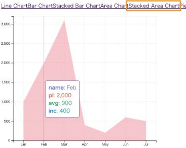
積み重ね棒グラフ のときと同様に、 3つのデータ系列 (pl, avg, inc) を積み重ねた表示にしてみます。
積み重ねを有効にする
vue3-charts では 棒グラフ (Bar), 面グラフ (Area) に関して積み重ねを有効にすることができます。 具体的には Bar, Area コンポーネント に対して Provide / Inject を用いて layerProps を指定の形式で渡します。
provide を用いて stacked: true を設定
StackedAreaChart.vueまずは provide を インポート します
import { defineComponent, ref, Ref, provide } from 'vue'defineComponent の中で layerProps を以下のように provide します
        provide('layerProps', {
            stacked: true, // enable stacking
        });

        return { data, direction, margin, axis }
Provide / Indect については、以下の公式ドキュメントを参考にしてください。
第2、第3のデータ系列を作成
現状は、pl データ に対応した AreaChartComponent が 1つだけある状態ですので、 avg, inc に対応した AreaChartComponent を追加していきます。
StackedAreaChart.vueavg を green, inc を blue として追加します。
        <template #layers>
            <Grid strokeDasharray="2,2" />
            <AreaChartComponent :dataKeys="['name', 'pl']" type="normal" :areaStyle="{ fill: 'red' }" />
            <AreaChartComponent :dataKeys="['name', 'avg']" type="normal" :areaStyle="{ fill: 'green' }" />
            <AreaChartComponent :dataKeys="['name', 'inc']" type="normal" :areaStyle="{ fill: 'blue' }" />
        </template>
この状態で プロジェクト を実行すると、以下のような 積み重ね棒グラフ が生成されます。
なお、vite の ホットロード を使っていると場合によっては表示が崩れてしまうことがありますので、その際は プロジェクト を再起動すると表示が直るようです。
次の セクション では、少し パラメータ を変えて 色々と試してみることにします。
様々な パターン
異なる type の混在
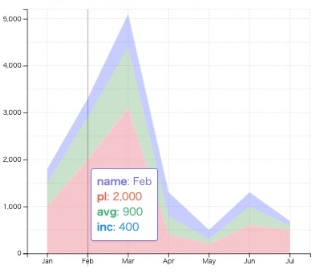
先ほどは 3つ すべて normal スタイル としましたが、 スタイルを混在させるとどうなるのでしょうか?
StackedAreaChart.vueavg の スタイルを step, inc の スタイルを natural としてみます。
        <template #layers>
            <Grid strokeDasharray="2,2" />
            <AreaChartComponent :dataKeys="['name', 'pl']" type="normal" :areaStyle="{ fill: 'red' }" />
            <AreaChartComponent :dataKeys="['name', 'avg']" type="step" :areaStyle="{ fill: 'green' }" />
            <AreaChartComponent :dataKeys="['name', 'inc']" type="natural" :areaStyle="{ fill: 'blue' }" />
        </template>
この状態で プロジェクト を実行すると、以下のように、異なる スタイル が混在して表示されます。
複数の グラデーション
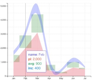
以下のように id を使い分けることで 各 データ系列ごとに 異なる areaStyle を適用することができます。
StackedAreaChart.vuepl 用の id を grad-pl, avg 用の id を grad-avg, inc 用の id を grad-inc として定義します。
            <AreaChartComponent :dataKeys="['name', 'pl']" type="normal" :areaStyle="{ fill: 'url(#grad-pl)' }" />
            <AreaChartComponent :dataKeys="['name', 'avg']" type="normal" :areaStyle="{ fill: 'url(#grad-avg)' }" />
            <AreaChartComponent :dataKeys="['name', 'inc']" type="normal" :areaStyle="{ fill: 'url(#grad-inc)' }" />
            <defs>
                <linearGradient id="grad-pl" x1="0%" y1="0%" x2="100%" y2="0%">
                    <stop offset="0%" stop-color="yellow" stop-opacity="1" />
                    <stop offset="50%" stop-color="orange" stop-opacity="1" />
                    <stop offset="100%" stop-color="red" stop-opacity="1" />
                </linearGradient>
                <linearGradient id="grad-avg" x1="0%" y1="0%" x2="0%" y2="100%">
                    <stop offset="0%" stop-color="green" stop-opacity="0.5" />
                    <stop offset="50%" stop-color="green" stop-opacity="1" />
                    <stop offset="100%" stop-color="green" stop-opacity="0" />
                </linearGradient>
                <linearGradient id="grad-inc" x1="0%" y1="0%" x2="100%" y2="0%">
                    <stop offset="0%" stop-color="blue" stop-opacity="1" />
                    <stop offset="50%" stop-color="red" stop-opacity="0.5" />
                    <stop offset="100%" stop-color="red" stop-opacity="0" />
                </linearGradient>
            </defs>
それぞれの パラメータ の意味は割愛しますが、この状態で プロジェクト を実行すると、以下のような 積み重ね面グラフ が表示されます。

工夫次第で凝った グラフ も作成できそうです。

まとめ
積み重ねを有効にするにはstacked: true とした layerProps を provide する
データ系列ごとに style, areaStyle を定義可能